Colour is the soul of interior design. It shapes mood, defines space, and creates harmony or deliberate contrast between different elements of your home. When it comes to flooring and wall design, tile colour combinations have the power to transform ordinary spaces into works of art.
At DeCeramica in Gurgaon, tiles are not merely surfaces; they are design tools, canvases of colour and texture that bring interiors to life. By applying simple principles of colour theory, you can make smarter choices that reflect your personality while enhancing functionality.
Why Tile Colour Combinations Matter in Interior Design
Every colour we choose affects how a room feels. Dark tones can make a space dramatic and cozy, while light hues expand a room, making it airy and calm. The right combination can:
- Visually expand or contract a space
- Define mood and atmosphere (warm vs cool, vibrant vs subtle)
- Harmonize with furniture, lighting, and décor
- Elevate the perceived luxury of your home
In busy urban homes of Gurgaon, where space is often a premium, choosing the right tile colours becomes even more critical.
The Basics of Tile Colour Theory
Before diving into combinations, let’s break down colour theory:
- Complementary Colours – Opposites on the colour wheel (e.g., blue & orange). They create high contrast and energy.
- Analogous Colours – Neighbours on the colour wheel (e.g., green, blue, turquoise). They feel harmonious and serene.
- Monochromatic Scheme – Variations of a single colour (e.g., light grey, medium grey, charcoal). Creates sophistication and simplicity.
- Triadic Scheme – Three evenly spaced colours on the wheel (e.g., red, yellow, blue). Dynamic and bold.
Tiles allow you to play with these theories not only in colour but also through finish, texture, and pattern.
Popular Tile Colour Combinations for Striking Interiors
1. Classic Black and White
Nothing says timeless like a black and white combination. Whether it’s checkerboard flooring or bold geometric wall tiles, this pairing creates a striking visual contrast. Perfect for modern kitchens and bathrooms in Gurgaon apartments.
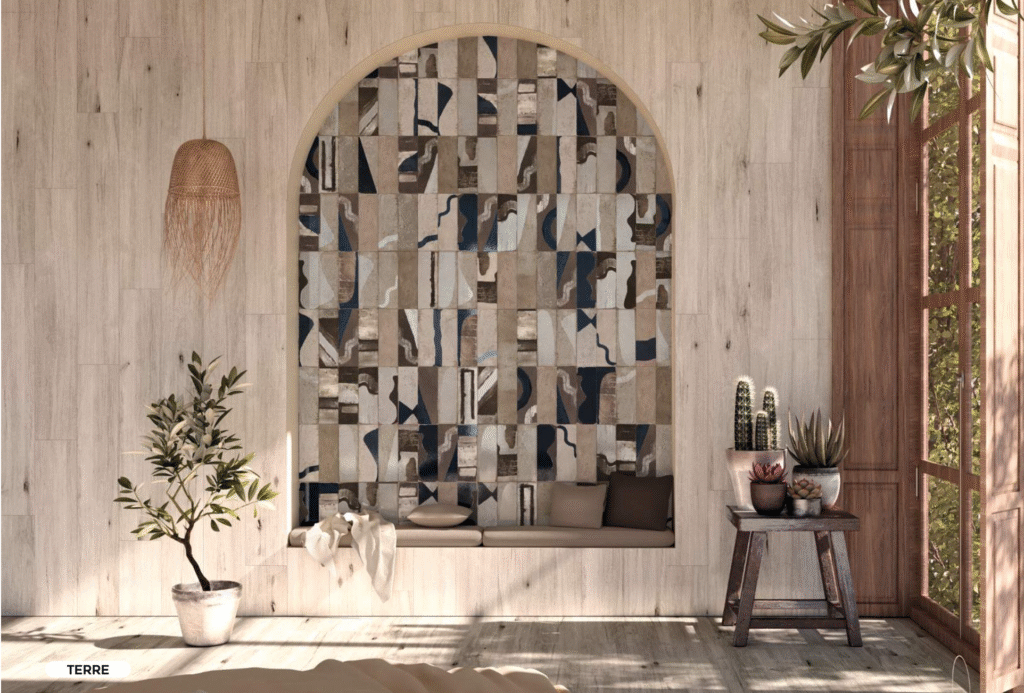
2. Warm Earth Tones
Terracotta, beige, and muted browns bring a grounded, organic warmth to interiors. Combined with wooden furniture, they suit farmhouses and rustic-chic spaces.
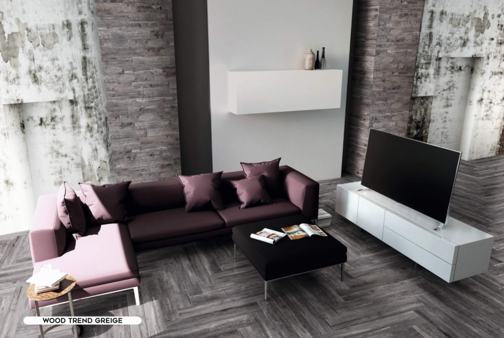
3. Cool Blues and Greys
Blues paired with soft greys lend a calming sophistication, ideal for bedrooms and bathrooms designed as urban sanctuaries.
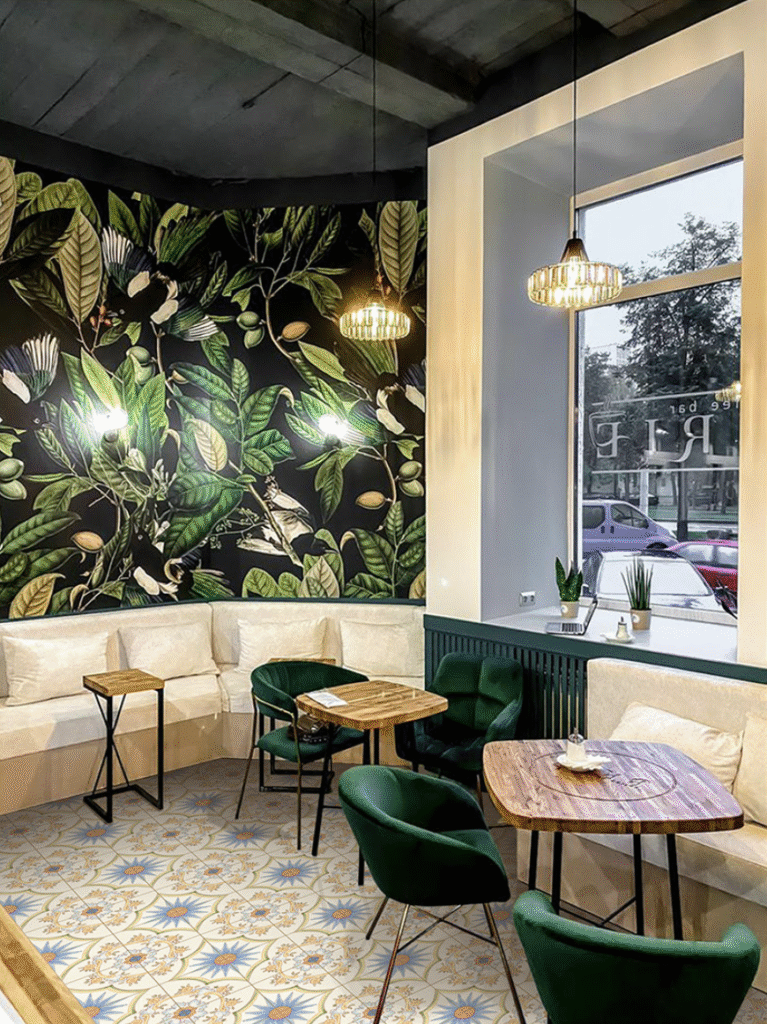
4. Bold Accents with Neutrals
Pairing a bold colour like emerald green or sapphire blue with whites or creams creates a luxurious yet balanced aesthetic. Accent walls or kitchen backsplashes shine with this style.
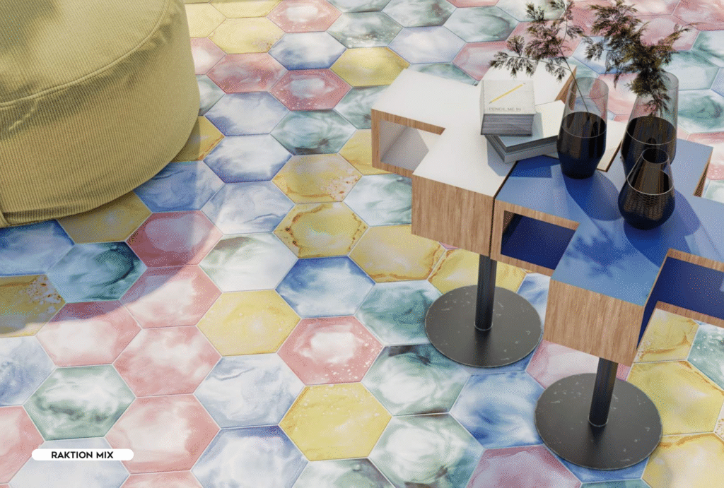
5. Soft Pastels with Neutrals
For a subtle, elegant look, pair pastel pinks, mint greens, or sky blues with light grey or beige tiles. Perfect for nurseries, living rooms, or open spaces.
Matching Tile Colours with Interior Elements
Tile colours should never be chosen in isolation. They must complement the furniture, lighting, and finishes in your home.
- Furniture & Cabinets: Wooden tones pair well with warm neutrals, while glossy lacquered finishes contrast beautifully with darker tiles.
- Countertops & Backsplashes: Choose subtle tile colours if countertops are bold, or add colourful tiles when countertops are neutral.
- Lighting: Natural light enhances lighter palettes, while artificial lighting can bring out the depth of darker tiles.
👉 Pro Tip: Visit DeCeramica’s showroom in Gurgaon to see how tile colour combinations shift under different lighting conditions.
Practical Tips for Choosing Tile Colours in Gurgaon Homes
- Consider Space Size – Light tiles expand small kitchens and bathrooms; dark tiles add intimacy to larger living rooms.
- Think Maintenance – White and very dark tiles show stains and dust more easily; mid-tones are easier to maintain.
- Play with Finishes – Glossy tiles brighten spaces; matte or textured tiles add sophistication and safety in wet areas.
- Blend Tradition with Modernity – Use neutral bases with colourful borders or patterned inserts to balance contemporary design with Indian aesthetics.
DeCeramica’s Tile Colour Combinations – Luxury with Choice
At DeCeramica, every collection is curated to showcase the harmony of colour and design. The showroom offers:
- Designer floor tiles with monochrome elegance and bold contrasts.
- Customised tile solutions where you can personalise patterns and palettes.
- Luxury bathroom tiles in calming blues, whites, and earthy tones.
- Living room statement walls with dramatic high-contrast tiles.
👉 Explore the Tiles Collection and discover striking colour palettes curated for Gurgaon homes.
Global Inspiration for Colour and Interiors
For homeowners and designers who want to explore further, these resources provide excellent inspiration on tile colours and interior design trends:
- Architectural Digest – Interior Colour Palettes
- Houzz – Tile Colour Ideas
- Elle Décor – Colour Trends
- Interior Design Magazine – Tile Inspirations
- Better Homes & Gardens – Colour Theory for Homes
Conclusion – Designing with Tile Colour Combinations
Colour has the power to transform interiors, and tiles are one of the most versatile mediums for bringing that power to life. From bold contrasts like black and white to soft pastels that whisper elegance, the possibilities are endless.
At DeCeramica, colour is more than a choice, it’s a design philosophy. By combining global trends with customised solutions, the showroom helps Gurgaon homeowners, architects, and interior designers create interiors that are not just stylish but also deeply personal.👉 Step into the DeCeramica showroom today to explore tile colour combinations and reimagine your spaces with luxury and balance.